

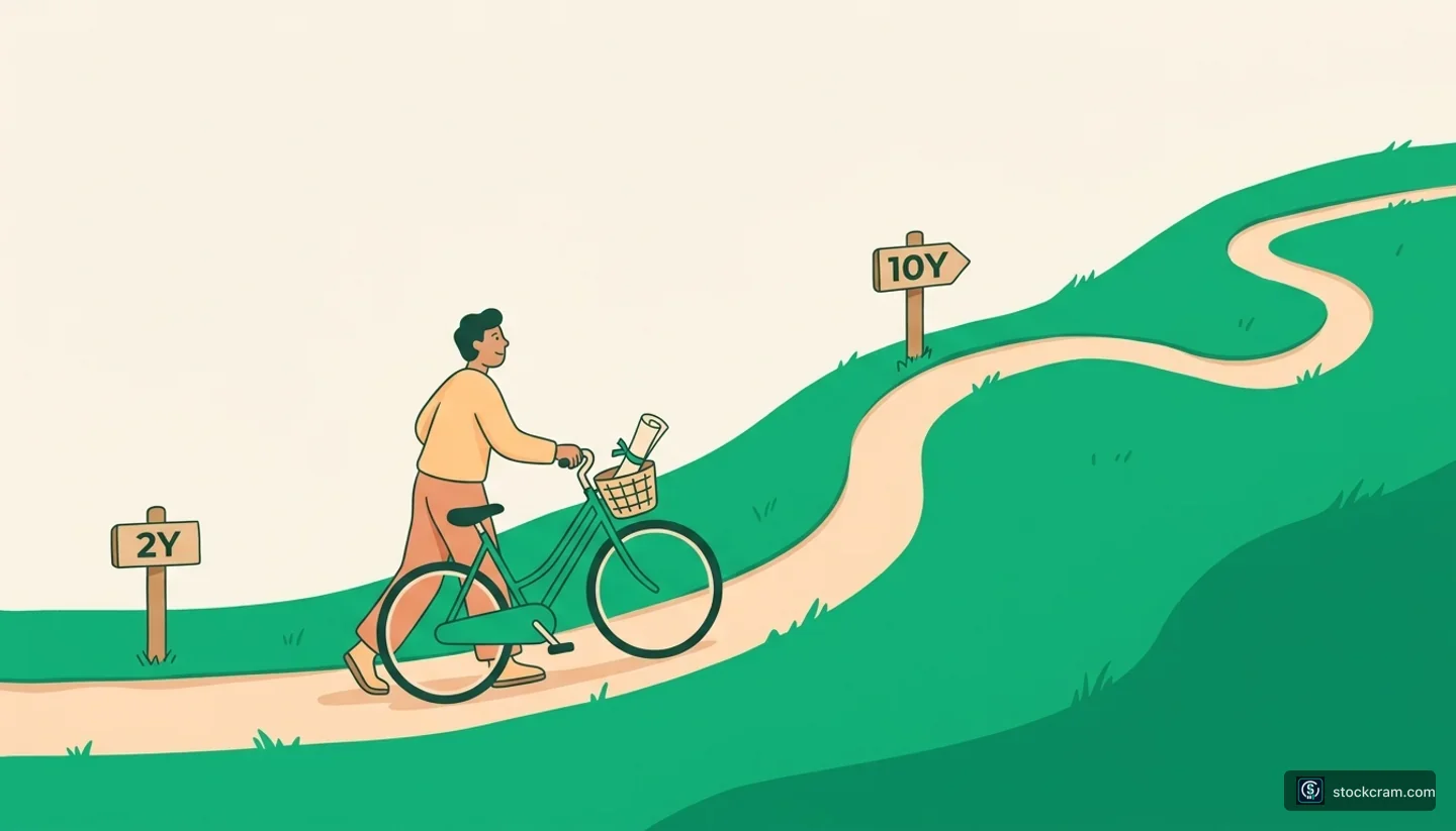
What Is the Yield Curve?
The yield curve is just a line on a chart. On the bottom you list the lengths of government loans — 3 months, 2 years, 10 years, 30 years. Up the side you plot the yield each one pays. Connect the dots and you get a curve that shows, at a glance, what investors earn for lending the government money for different amounts of time.
It uses Treasuries because they're all issued by the same borrower — the U.S. government — so the only thing changing along the line is how long you lend. That makes it a clean way to see how time alone affects the payout.
The One-Sentence Version
The yield curve is one line plotting Treasury yields from the shortest loans to the longest. Its shape — sloping up, flat, or sloping down — is what everyone reads it for.
The Normal Curve Slopes Up
Most of the time, the curve slopes upward: longer loans pay more. That makes sense. If you lock your money away for 10 years instead of 3 months, a lot more can happen — interest rates could climb, prices could rise, the future is foggier. So you demand a little extra to wait that long and take that extra risk.
Think of a CD
It's like a savings CD at a bank. A 5-year CD normally pays more than a 6-month one, because you're promising to leave your money untouched for longer. Lending longer earns more — that's the normal, healthy shape of the curve.
Flat and Inverted Curves
Sometimes the curve loses its upward tilt. When short and long yields sit close together, the curve goes flat — the extra pay for lending longer has nearly vanished. And once in a while it goes the other way entirely: short-term loans pay more than long-term ones. That's an inverted yield curve, and it's the weird one.
Why Inversion Is the 'Weird' Case
Normally you'd demand more to lock your money away longer. An inversion flips that: short money pays more than long money. It's like a bank offering a higher rate on a 6-month CD than on a 5-year one — backwards enough that people take it as a sign something unusual is going on.
The 10-Year vs the 2-Year
The whole curve has many points, but one comparison gets watched more than any other: the 10-year Treasury note versus the 2-year. People subtract one from the other to get a single number. When the 10-year pays more than the 2-year, that gap is positive and the curve is normal. When the 2-year pays more than the 10-year, the gap turns negative — the curve is inverted. The two shapes look like this:
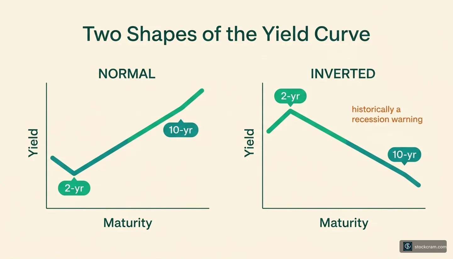
Here's a stylized example. These aren't real figures — they're round numbers to show the two shapes side by side.
| Maturity | Normal curve | Inverted curve |
|---|---|---|
| 3-month | 4.2% | 5.4% |
| 2-year | 4.6% | 5.0% |
| 10-year | 5.1% | 4.6% |
| 10yr minus 2yr | +0.5% (normal) | −0.4% (inverted) |
Stylized yields only — not real market data. On the normal curve, longer pays more. On the inverted curve, the 2-year out-pays the 10-year.
In the left column, each step out pays a bit more — the classic upward slope. In the right column, the short end pays the most and the line tilts down. Same chart, telling two very different stories about what investors expect.
Why an Inverted Curve Gets Attention
An inverted yield curve draws a lot of headlines, and the reason is about history, not prophecy. Historically, an inverted 10-year-versus-2-year curve has often appeared before a recession. That track record is why economists, the Federal Reserve, and markets all keep an eye on it.
A Pattern, Not a Prediction
This is strictly a historical observation, not a forecast and not a trading signal. The curve has inverted without a downturn following, and the timing between an inversion and any slowdown has varied widely. Treat it as one indicator people watch — never as a guarantee of what comes next.
The intuition some offer: an inversion can reflect investors expecting short-term rates to fall later, which often happens when the economy cools. But that's a guess, not a certainty. What's safe to say is this: the yield curve is a widely-followed gauge of the bond market's mood, and its shape is one piece of a much bigger picture.
| Curve shape | What it looks like |
|---|---|
| Normal | Slopes up — longer loans pay more |
| Flat | Short and long yields nearly equal |
| Inverted | Slopes down — short loans pay more than long |
The three shapes of the yield curve at a glance.
Educational use only
Educational content only. StockCram isn't a broker or adviser, and we have no affiliation with any institution we name.